

Typography
Our Fonts
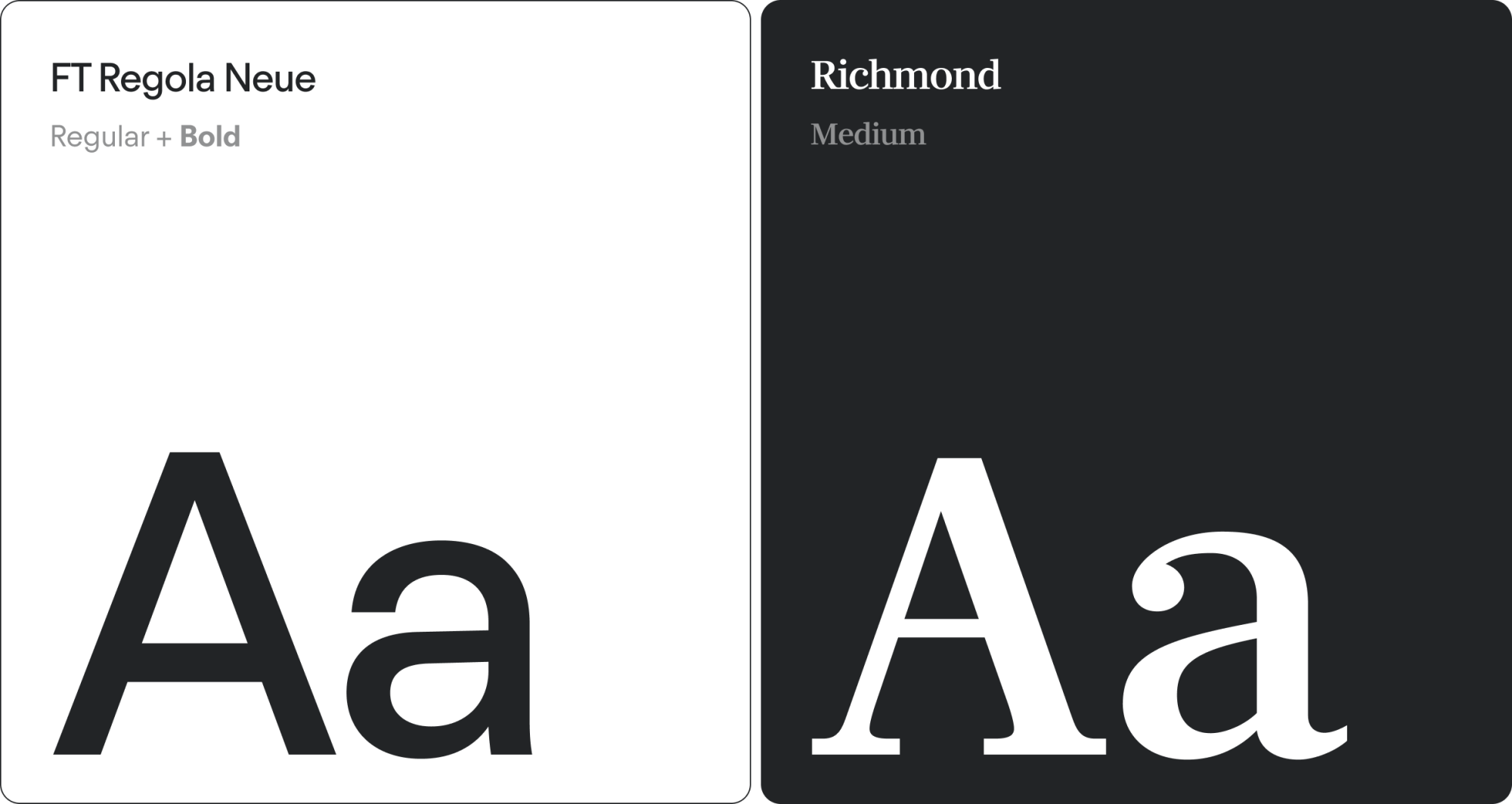
Our brand uses two typefaces: Regola and Richmond.
Regola is our primary typeface, used for body copy, subheadings, and general communication. Richmond is used exclusively within headlines to call out key words or points; it should never appear in body copy or as standalone text.
Both typefaces must be used across all brand touch-points, including digital platforms, presentations, and print materials.
Richmond is an adobe font, so ensure you have the correct logins/ licensing to use; Richmond font.
Dual Font Usage
For every Copper display headline we use a dual font approach for greater impact and personality.
Our dual font utilises FT Regola Neue Regular for the first line/lines and Richmond Medium on either the last line or where greater emphasis is expressed on key words.

Font Hierarchy
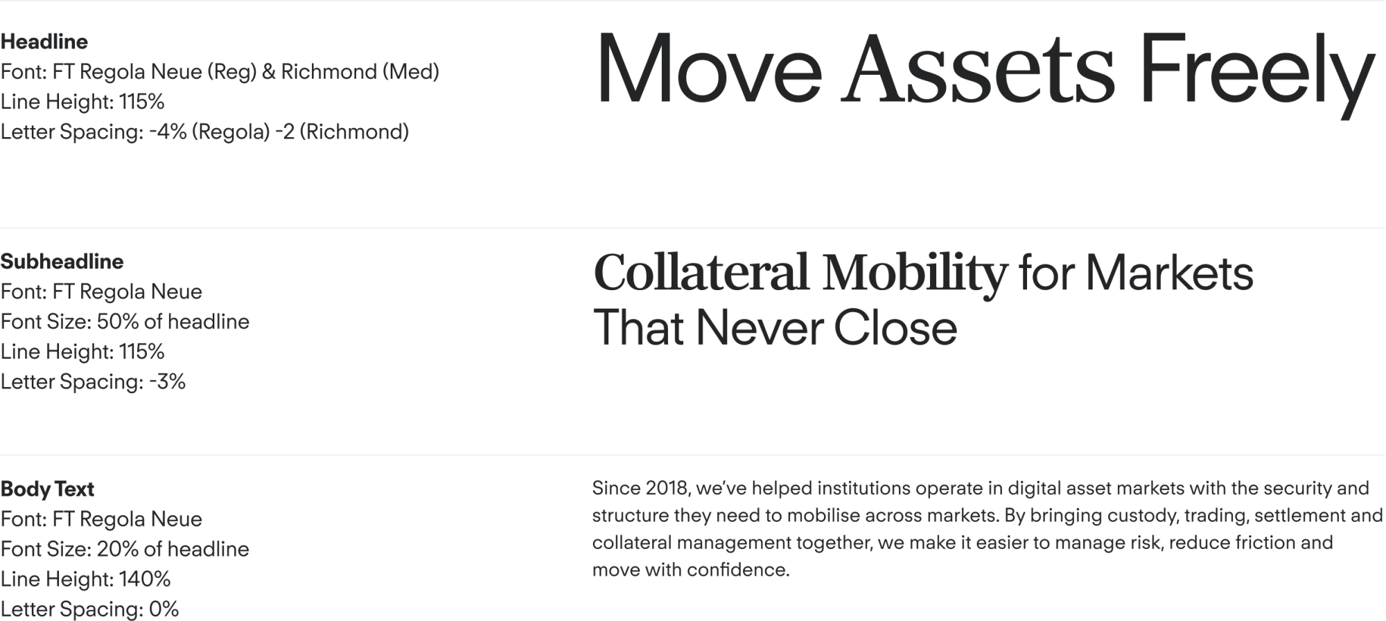
The following visual demonstrates the recommended typographic hierarchy. It includes guidance on font sizing, weight, line height, and letter spacing for headlines, subheadings, and body text. Reduced letter spacing is applied to headlines and subheadings, as indicated below.
Font Usage
The following visual demonstrates a realistic type hierarchy in action; use this as a reference guide going forward.