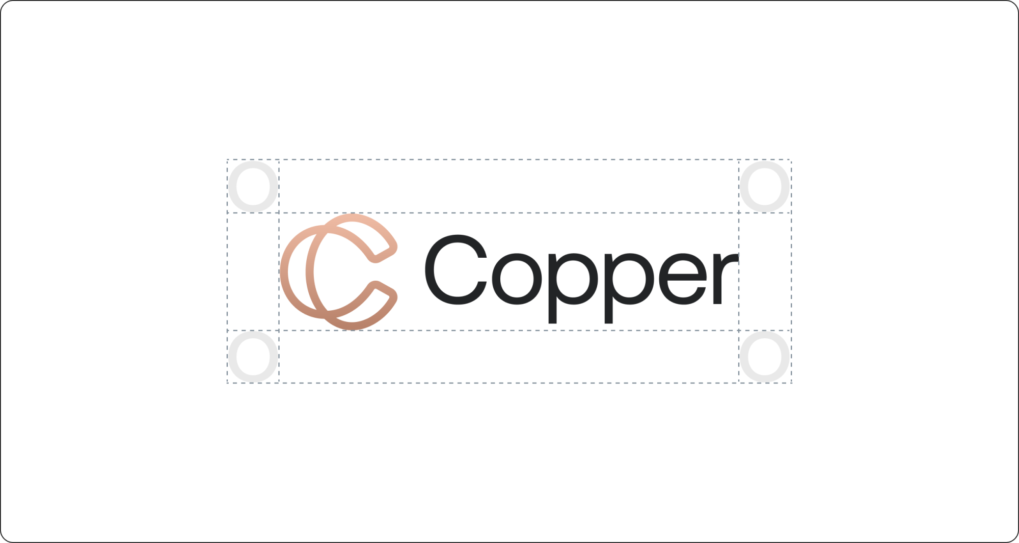

Logo Lockup
Logo Lockup
The logo lockup consists of two elements; the logomark and the wordmark. It’s an instantly recognisable brand element and should be represented consistently throughout our product and marketing efforts. The wordmark must always be locked up with the logomark and never detached.
The logomark should always be placed to the left hand side of the wordmark.
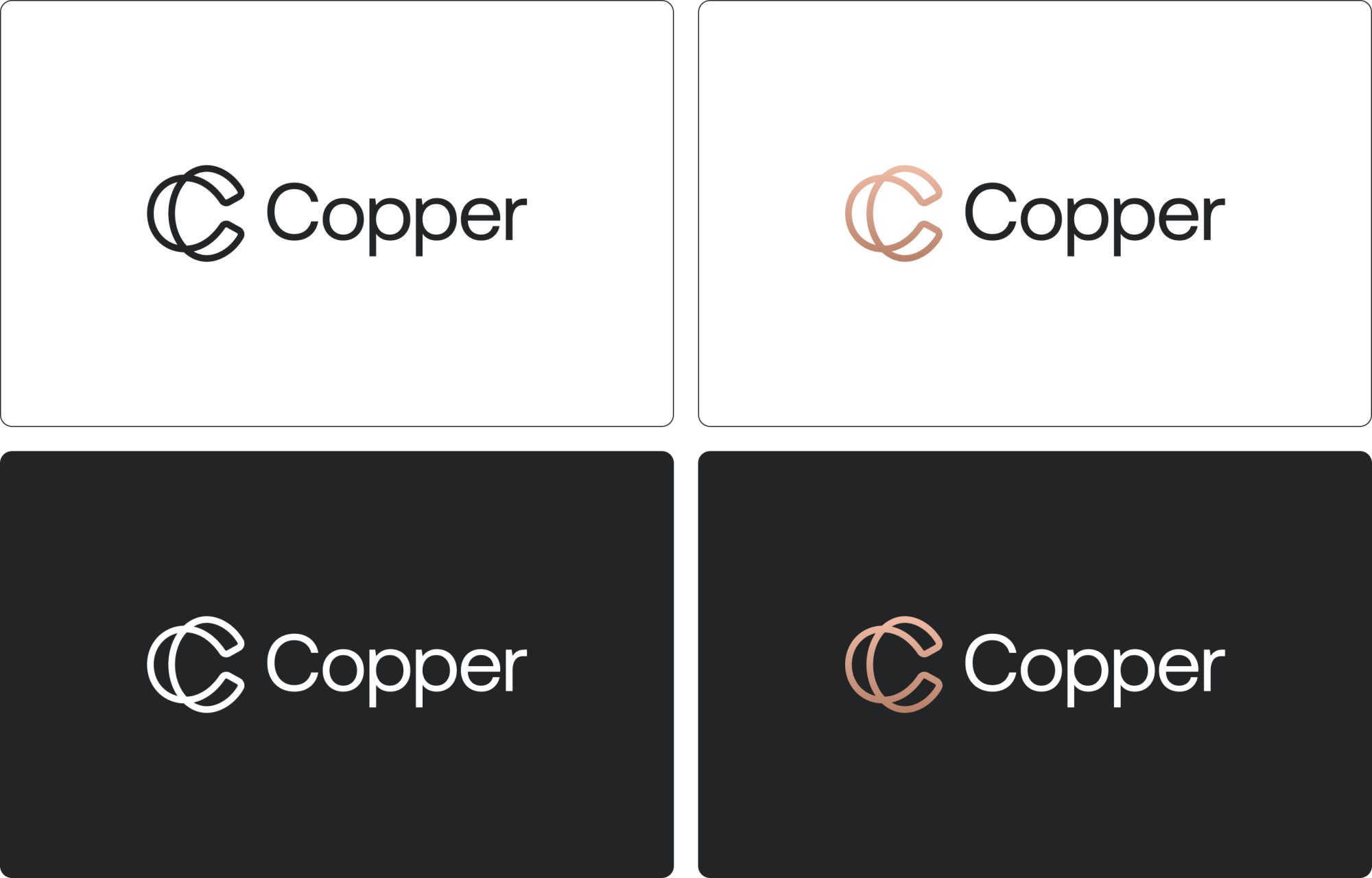
Logo Colour Use
The primary logo is supplied in two colourways: white and charcoal with Copper gradient. Always choose the version that ensures clear visibility and strong contrast with its background.
Whenever possible, the logo should appear on the primary white or black backgrounds. These applications reflect our core brand values and are suitable for instances when a quieter brand presence is necessary, such as a header on a website or letterhead and business card.
Note: We do have full black and white logo’s just incase.
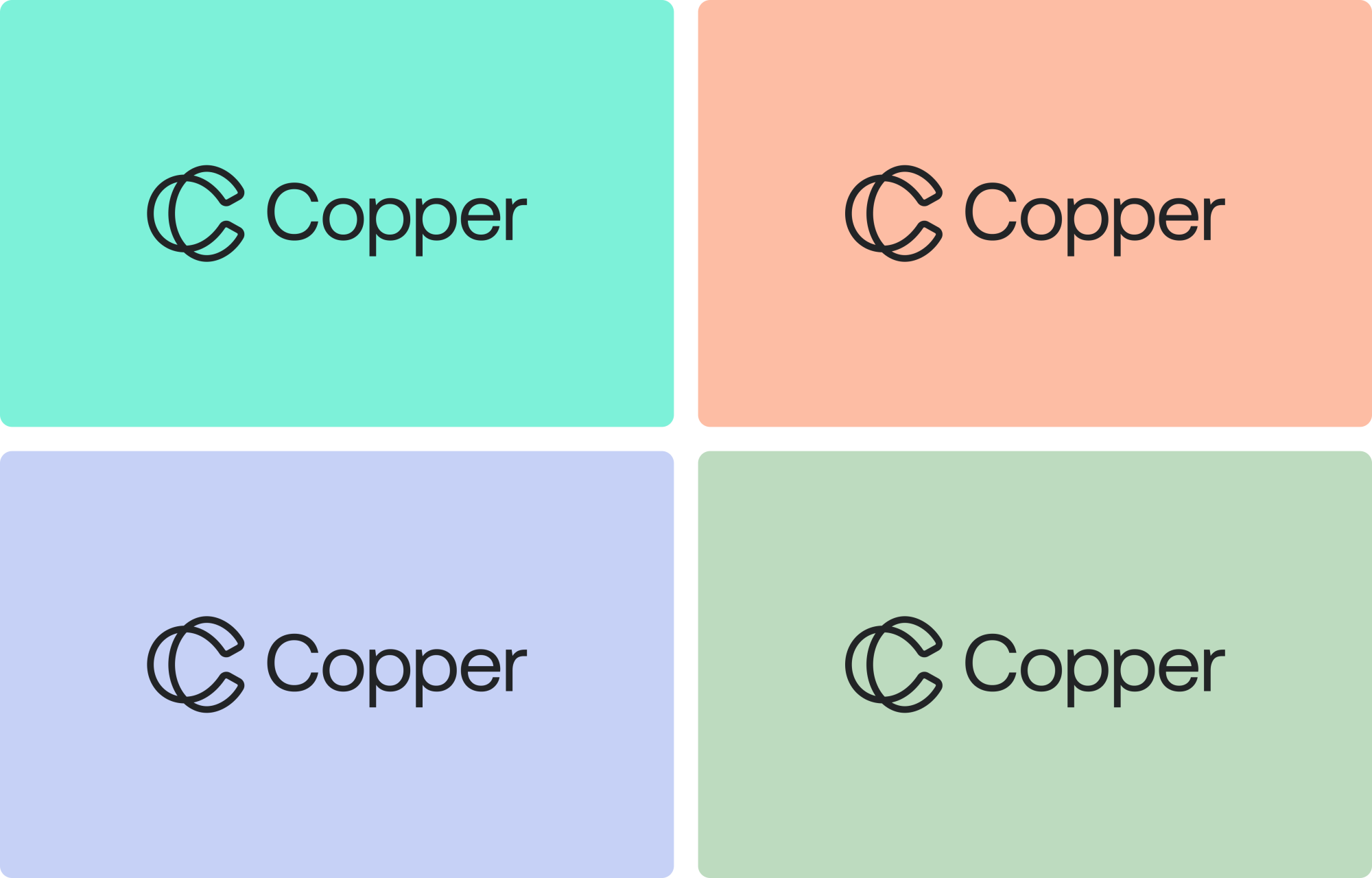
Secondary Colour Use
When a louder brand presence is needed, such as a billboard or subway advertisement, the logo may be paired with a selection of our secondary brand colours.
Clear Space
Use the height of the ‘O’ to determine the minimum clear space around the logo. This area must remain free from any other design elements.