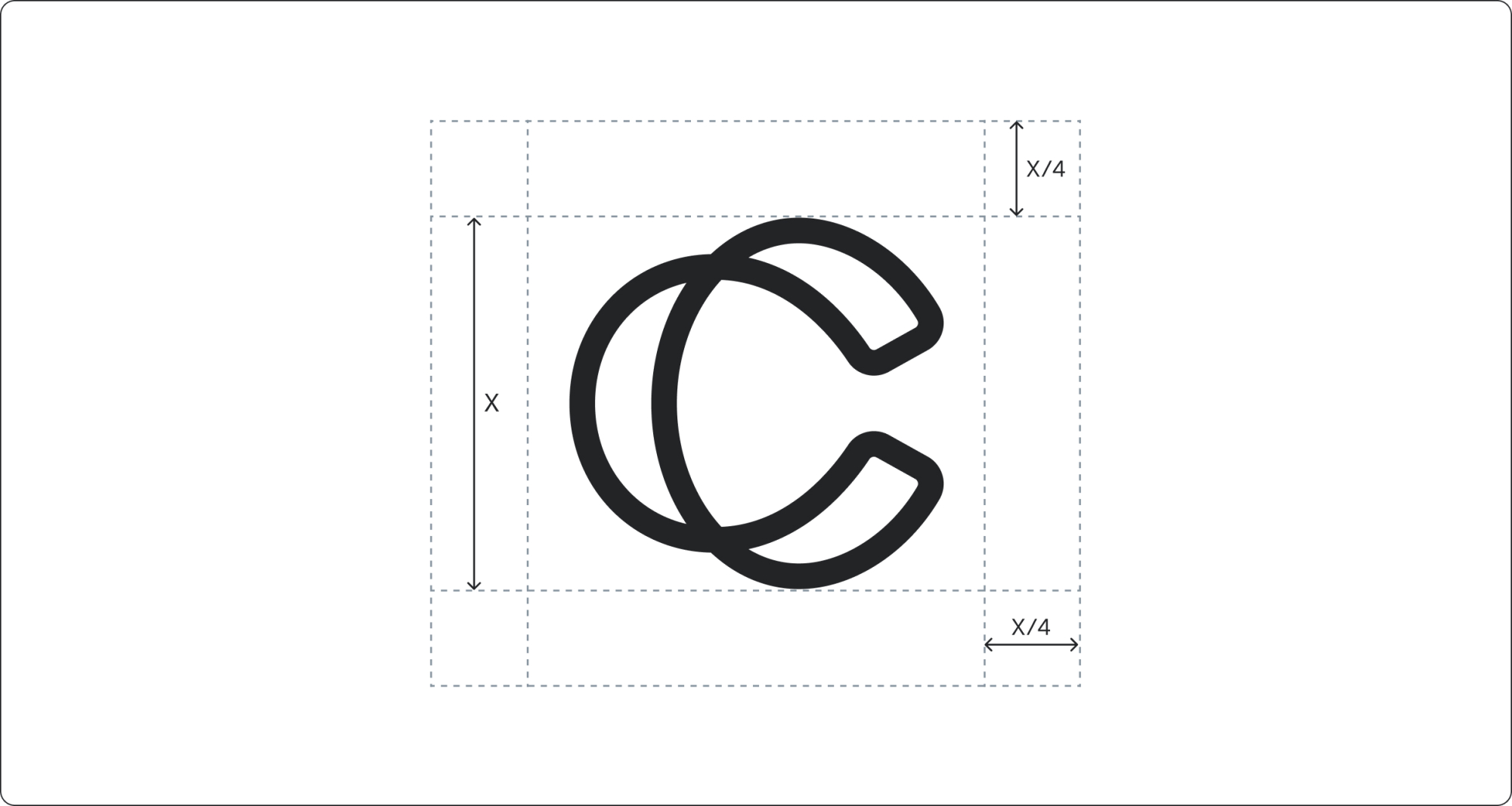

Logomark
Copper Logomark
We have one core symbol that is always used in combination with the Copper wordmark. Our symbol captures precision in motion – built on decades of experience, designed for what’s next.
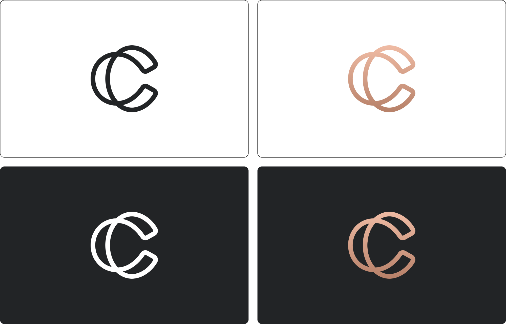
The brand icon is supplied in three colourways: Copper gradient, white and charcoal. Always choose the version that ensures clear visibility and strong contrast with its background.
Logomark Primary Colour Use
The brand icon is supplied in three colour ways: Copper gradient, white and charcoal. Always choose the version that ensures clear visibility and strong contrast with its background.
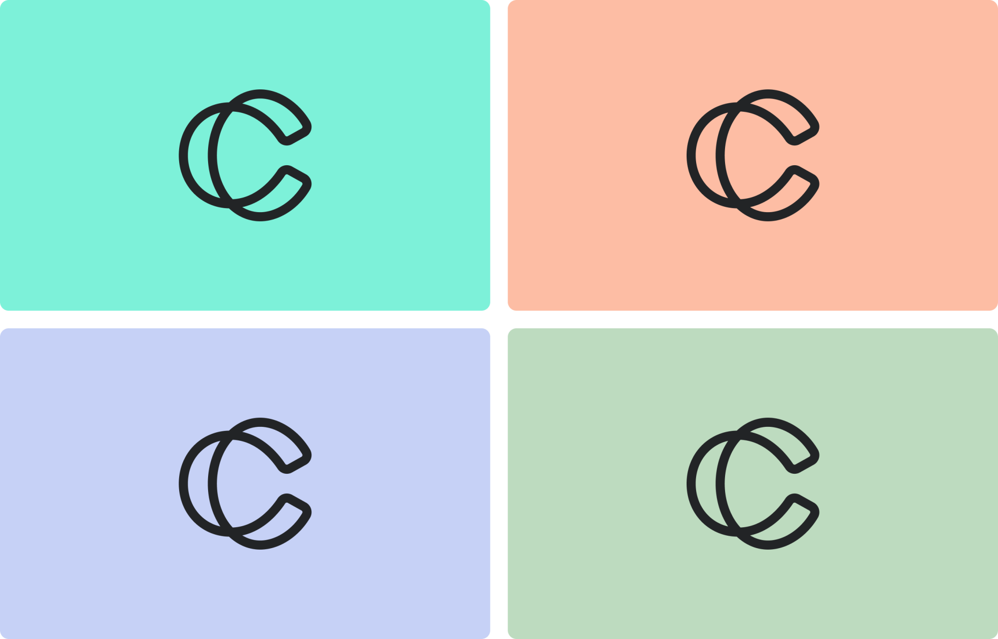
Logomark Secondary Colour Use
Clear Space
Clear space is defined using a quarter of the icon’s height (X/4). This measurement is applied on all sides to ensure the icon has enough room to breathe and remains visually clear across applications.